
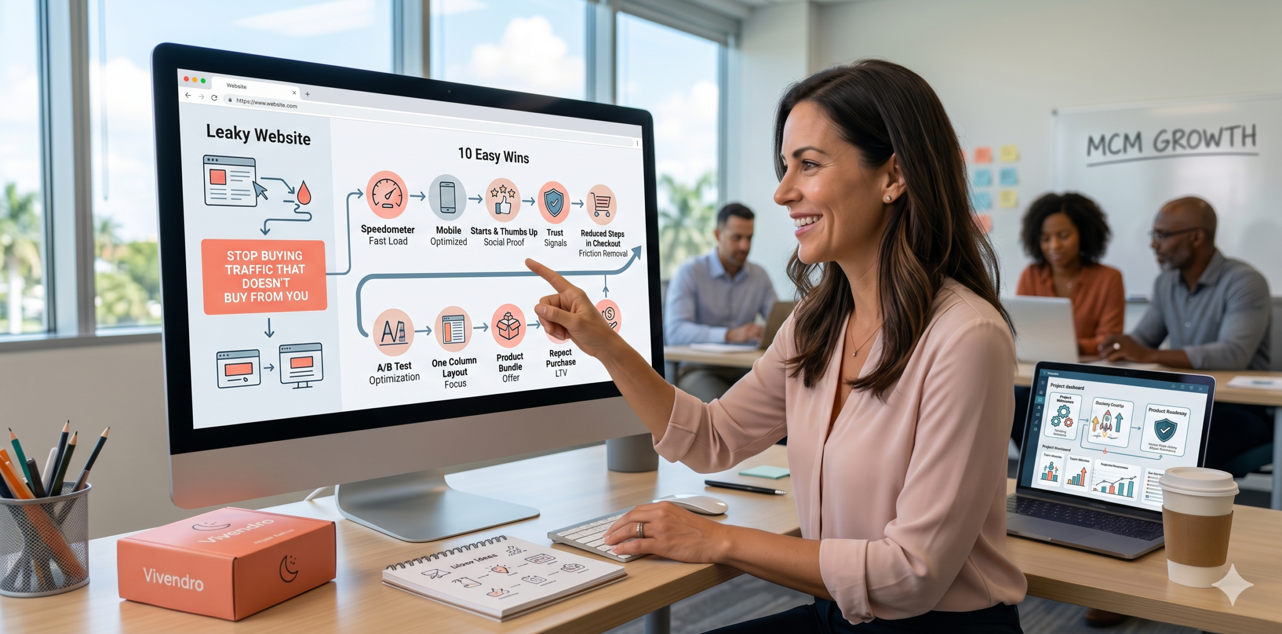
Stop Buying Traffic That Doesn't Buy From You
The Bottom Line
Revenue Optimization: Fixing your website’s ability to sell is more impactful than increasing your ad budget because it raises the value of every visitor you already have.
Mobile Dominance: With over 60% of web traffic occurring on phones, a site that is hard to use on a small screen is something that quietly drains money [Liability].
Social Proof: Adding real customer reviews and trust signals creates an unfair advantage competitors can’t easily copy [Moat].
Friction Removal: Reducing the number of steps in your checkout process directly improves your MCM [Marketing Contribution Margin, or the cash profit left after all variable costs are paid].
Speed Metrics: Every second of delay in page loading reduces your LTV [Lifetime Value, or the total revenue a buyer generates over their entire relationship] by frustrating customers before they even see your offer.
Traffic is no longer a cheap commodity that you can simply “buy” until you succeed. If your website is hard to navigate or slow to load, you aren’t just losing sales, you are actively subsidizing your competitors by training customers to look elsewhere.
We’ve found that the financial delta is created when a business stops obsessing over “getting more clicks” and starts obsessing over “making clicks count.” This shift in focus ensures that your marketing spend results in more cash in the bank rather than just more “eyes” on a page.
By applying these ten easy wins, you transform your website from a digital brochure into something that works for you even when you’re offline [Asset].
How do we make the website load fast enough for the modern buyer?
Site speed is the absolute foundation of keeping more of what you earn. If your page takes more than three seconds to load, half of your potential customers have already clicked the back button.
We’ve found that the financial delta is created when you optimize your images and remove heavy scripts that slow down the user’s phone. A faster site doesn’t just please your customers, it makes it cheaper for you to show up in search results.
In our market experience, this is the most common place where money quietly drains away. You can’t sell to someone who never sees your products because they got tired of waiting for the header to appear.
What is the most effective way to use social proof?
People don’t buy what you sell, they buy what others say about what you sell. Placing reviews and video testimonials near your “Buy” buttons creates a psychological safety net for the customer.
What each customer truly costs vs. brings in [Unit Economics] improves when they feel they can trust you without a long investigation. User-generated content, like a photo of a real customer using your product, is far more impactful than a professional studio shot.
In our experience, this is usually where most brands lose their momentum by hiding their best testimonials on a separate page. Put your wins right where the money changes hands to reduce the stress of the buying decision.
How do I scale my website for mobile users?
Your website should be designed for a thumb, not a mouse. Buttons need to be large, text needs to be readable without zooming, and the “Add to Cart” button should stay within reach at all times.
What we’ve observed across national campaigns is that mobile conversion rates usually lag behind desktop because of “fat-finger” errors and tiny forms. If your checkout process requires a keyboard and ten minutes of typing, you are losing the battle for the mobile shopper.
This creates a stable business by ensuring you are capturing the 65% of adults who shop while they are on the go. Don’t let a clunky mobile design become a liability that drains your advertising budget.
Why should we simplify the navigation menu?
A confused mind always says “no.” If your menu has twenty links and three sub-layers, your customer will feel overwhelmed and leave.
We’ve found that the financial delta is created when you limit your main menu to five or fewer key categories. Guide the customer exactly where they need to go, rather than making them work to find your best sellers.
In our experience, this reduces the “mental load” for the visitor, leading to fewer surprises and more completed checkouts. Clarity always beats cleverness when it comes to the structure of your site.
How do we improve the clarity of the call to action?
Your “Call to Action” [CTA, or the button that tells a user what to do next] needs to stand out like a beacon. Use a contrasting color that isn’t used anywhere else on the site so the eye is naturally drawn to it.
We’ve found that the financial delta is created when the text on the button is specific, like “Get My Free Quote” instead of just “Submit.” Specific language reduces the fear of the unknown and encourages the user to take the next strategic step.
In our experience, the strongest agencies never use “Click Here” because it doesn’t describe the outcome. Tell them exactly what they are getting so they feel in control of the process.
2026 Performance Benchmarks
| Benchmark | 2026 Signal | Strategic Read |
| Mobile Traffic Share | 68% | Mobile-first is no longer a suggestion, it’s a survival requirement. |
| Page Load Threshold | 1.8 Seconds | Users expect near-instant response or they bounce to a competitor. |
| Trust Signal Impact | +24% Lift | Verified reviews near the CTA significantly increase buyer confidence. |
| Checkout Steps | 3 or Fewer | Reducing clicks to purchase directly increases the cash you keep. |
| Form Field Count | 4 Fields Max | Each additional field reduces conversion probability by roughly 8%. |
| Video Content Usage | 52% of Buyers | Product videos are now a primary tool for “Information Gain.” |
| Dark Mode Adoption | 45% of Users | Ensuring your site looks good in dark mode prevents eye strain and exits. |
| Social Login Usage | 35% Lift | Allowing login via Google/Apple reduces friction and speeds up sales. |
| AI Chatbot Success | 12% Conversion | Automated help for simple questions saves sales that would otherwise drift. |
| Privacy Transparency | 92% Importance | Showing how you protect data is now a mandatory trust factor. |
How do I use “Negative Space” to increase focus?
Clutter is the enemy of conversion. By leaving “White Space” [empty space around your text and images], you allow the customer’s eyes to rest and focus on what truly matters: your product.
A clean design signals a professional operation and helps build an unfair advantage competitors can’t easily copy. When your site is easy to read, the customer stays longer, which improves your MCM by increasing the chances of a sale.
In our experience, small business owners often try to cram every feature onto the homepage. This quietly drains the user’s attention and leads to a higher “Bounce Rate” [the percentage of people who leave after seeing only one page].
Why is “One Column” better for landing pages?
Multi-column layouts create “Visual Competition” where the user doesn’t know where to look first. A single-column flow leads the eye in a straight line from the problem to your solution.
We’ve found that the financial delta is created when you tell a story that flows vertically. This structure works perfectly on phones and ensures that your message is delivered in the exact order you intended.
In our experience, this leads to fewer surprises for the buyer because the path to the “Buy” button is unmistakable. Simple layouts translate into more cash and less stress for you and your team.
How do we utilize “Urgency” without being annoying?
Urgency should be helpful, not pushy. Phrases like “Only 3 left in stock” or “Order in the next 2 hours for Tuesday delivery” provide valuable information that helps a customer make a decision.
Authentic urgency protects your keeping more of what you earn because it prevents the customer from “thinking about it” and never coming back. If you use fake timers, you destroy the trust you’ve worked so hard to build.
In our experience, the financial delta is finalized when the urgency is tied to a real constraint, like shipping times or stock levels. This makes the customer feel lucky to get the item rather than pressured to buy it.
What is the “F-Pattern” and how do I use it?
Most people read websites in the shape of the letter F, scanning the top and then down the left side. Place your most important information, like your logo and your primary offer, in these “High-Value” zones.
We’ve found that the financial delta is created when you align your site’s layout with how humans naturally process information. If your best feature is hidden in the bottom right corner, most people will never see it.
In our experience, this is a simple tweak that turns your site into an asset that works for you even when you’re offline. Align your site with natural behavior to reduce the cost of getting that next sale.
How do I fix “Analysis Paralysis” in my shop?
Giving a customer too many choices often results in them choosing nothing at all. Limit your “Featured Products” to the top three or four items to make the selection process easy.
We’ve found that the financial delta is created when you use a “Best Seller” or “Our Pick” badge to help the customer decide. This reduces the stress of making the wrong choice and speeds up the path to the checkout.
In our experience, this is a key part of keeping more of what you earn. By guiding the customer toward your highest-margin or highest-rated items, you ensure both a happy client and a healthy profit.
Summing It Up: The Boardroom Recommendation
Optimizing your website’s ability to convert is the most reliable way to increase your Enterprise Value [the total dollar worth of your business]. Every small win we’ve discussed today contributes to a site that is a hard-working asset rather than a liability that drains your marketing budget.
We recommend starting with the “Speed” and “Mobile” wins first, as these provide the foundation for everything else. Once your site is fast and easy to use on a phone, the psychological wins like “Social Proof” and “Urgency” will have a much greater impact.
The goal is to build an unfair advantage that competitors can’t easily copy by creating a seamless, trustworthy, and fast experience for your customers. In 2026, the brands that win are the ones that make it the easiest for the customer to say “yes.”
People Also Ask
Q: How do I know if my website’s conversion rate is “good”?
A: While it varies by industry, a rate of 2% to 5% is generally considered healthy. However, you should focus on improving your own baseline rather than comparing yourself to generic industry averages.
Q: Will these changes work if I don’t have a lot of traffic yet?
A: Yes. In fact, it is better to fix these issues while your traffic is low so that every new visitor you eventually pay for is much more likely to convert into a sale.
Q: Do I need a professional developer to make these changes?
A: Many of these “wins,” such as simplifying your menu or adding reviews, can be done through your website’s dashboard (like Shopify or WordPress) without writing any code.
Q: How often should I test new changes on my site?
A: We suggest testing one major change at a time and letting it run for at least two weeks to see how it affects your sales before making another move.
Q: What is the most important “win” for a brand new site?
A: Speed and mobile usability are the “Non-Negotiables.” If people can’t open your site on their phone or it takes too long to load, nothing else you do will matter.
Sources

Pinterest is No Longer a Virtual Pinboard; It is an eCommerce Goldmine
The Lifecycle Engine: Orchestrating Email Automation for Revenue Scalability
Turning Limited Spend into Market Authority
Get the latest digital marketing insights, strategies, and industry trends delivered directly to your inbox.
Weekly insights
No spam
Unsubscribe anytime
Join 10,000+ marketers who trust eMarketLift for cutting-edge digital marketing insights.